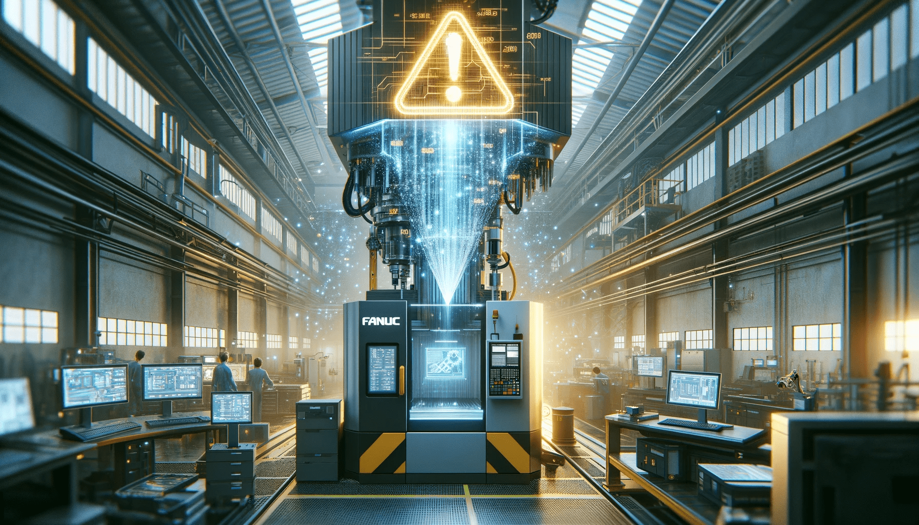
Introduction
All MachineMetrics customers have the opportunity to participate in our benchmarking program at no additional cost, which allows them to compare their own factory’s utilization against industry norms. Since we have a statistically significant sample size (+- 1.8% margin of error as of today), customers find this to be a reliable indicator when evaluating their own company’s performance not just against their own internal goals, but also relative to industry performance as a whole. This is important because industry norms may shift over time, depending on macroeconomic conditions and business cycles. In essence, our large sample size permits useful comparison to determine if your shop is following trends or not.
Is the dip in utilization you saw last quarter because less jobs came in because of something specific to your shop? Or are all shops experiencing this dip? Is the decrease in machine use this month (and resulting backlog) because a few employees got poached by Amazon’s warehouses - just affecting you, or the entire industry?
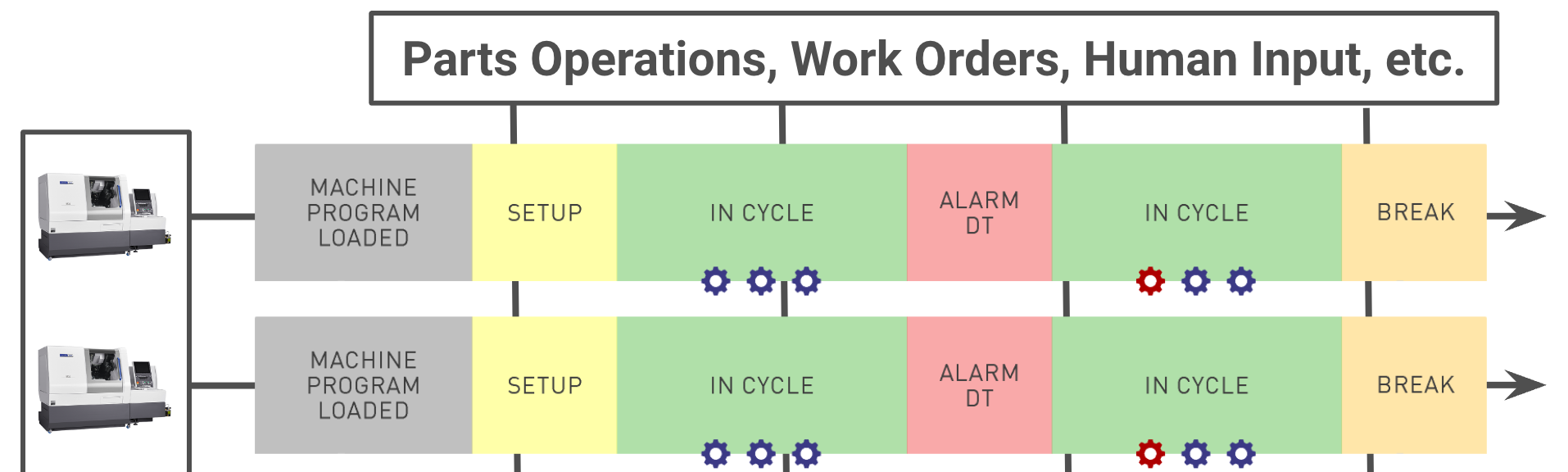
Legacy Benchmarking
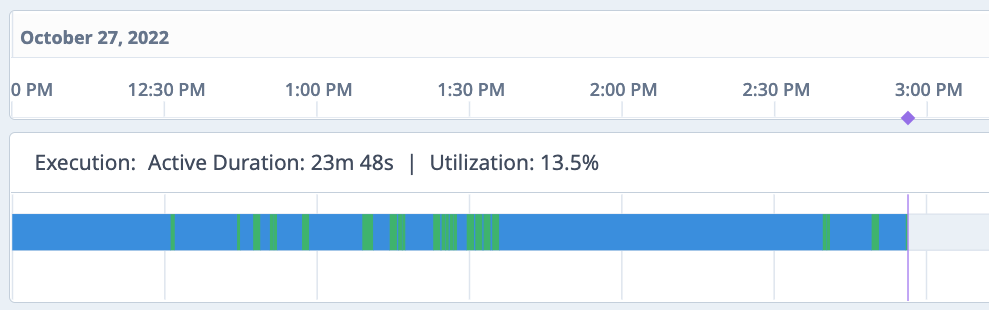
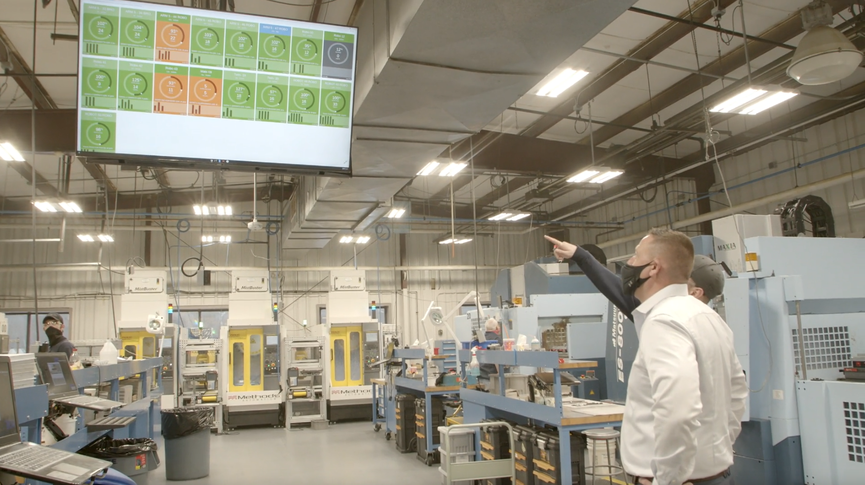
These are all questions which our benchmarking offering seeks to answer. Previously, we would give a simple benchmark, by machine type, for each customer for 24/7 utilization and “key hours” utilization, which are the hours we see as the most popular hours of operation for our customers (8 AM - 4 PM, M-F). A sample of this is below.
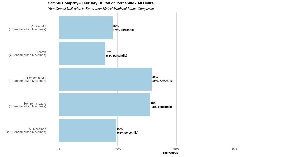
[View full size image]
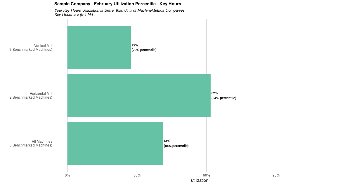
[View full size image]
Our customers have found this helpful in everything from purchasing decisions (do we need to buy that new machine? Is our utilization for existing machines already in the top percentile, and we are truly maxed out, or are most people squeezing more out of these types of machines?), to sales planning (do we need to revise our forecasts downwards because of a persistent, industry trend?).
New Benchmarking
We are excited to introduce a new, and more detailed take on this. Instead of simply listing each machine type’s utilization and its respective percentile, we are now plotting distributions, and the customer will be able to see their relative position within each machine type distribution. This allows them to not just view their ranking, but also what the underlying organization of utilization is for each category they’re in.
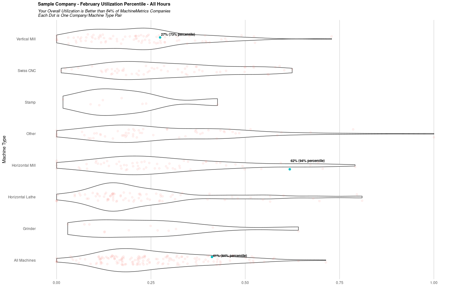
[View full size image]
What interesting shapes, you say. Each of those shapes represents the distribution of machine utilization for each category. The fatter the shape is at each utilization percent, the more common it is for companies who have those machines to have that particular utilization. Each dot in this case is a company/machine-type pair, and you’ll see that the heavier the concentration is at any particular point, the wider the curve is. This is called a violin plot, and is essentially a double-sided mirrored histogram. Compared to the boxplot, a violin plot contains some critical context about where one falls in the distribution - a mere percentile number may not be very meaningful if the underlying distribution is not normally distributed (Gaussian). For example, the “Other” category has a fat-tail distribution because we group all machines that are not CNCs under this classification. This could include conveyor belts, paint booths, and even a luggage carousel at Milwaukee Airport. Obviously, these have very different usage patterns, which is reflected in the fact that some of these machines seem to have near 100% utilization, and some near zero. Oh, and don’t mind the y-position of the actual dots - the x-position matters because it gives utilization, but the y-position is randomly generated to give some slack to how tight the clusters are, and is purely for visualization purposes.
We will also be adding a separate plot focused on overall machine utilization. This plot includes all machines benchmarked for that month, for any category, and each company will receive their relative ranking compared to the 25th and 75th percentile, as well as the peak concentration of utilization for that month. This can help companies track not only their percentile, but also where they stand relative to an average shop, a low-performing shop, and a high-performing shop.
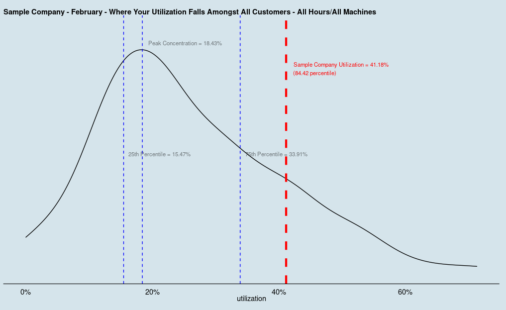
[View full size image]
Last Thoughts
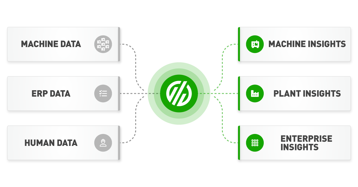
Customers of MachineMetrics enjoy this unique benefit for free due to the symbiotic value this provides. Since we are a cloud-only provider, we sit on large stores of data that are otherwise not available to on-prem or siloed data organizations. One of the unique advantages we have is that industry insights, such as this, that cannot be garnered elsewhere, are shared back to our customers in order to make their businesses more data-driven and ultimately more competitive, allowing them to expand their business and buy more machines that get hooked up to MachineMetrics - a virtuous and symbiotic cycle.
.svg)

Comments