Book a Demo of MachineMetrics
The leading platform to collect, monitor, analyze, and drive action with machine data. Set up time with a product specialist to learn how we can help your operation.
Ready to empower your shop floor?
Learn More.svg)

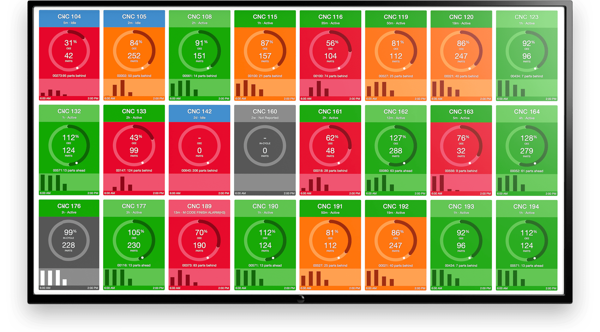
Here at MachineMetrics, we are always striving to improve our product and add new insights and features for our customers. This is especially true as we continue to grow our market share and capture an even greater understanding of the dynamics of capacity utilization. Today, we’re excited to announce some important improvements to our benchmarking product.
To give some background, all customers with more than 4 machines connected to MachineMetrics receive a monthly benchmarking report - they are able to see their own factory’s performance relative to the thousands of machines across the MachineMetrics customer base. According to AMT - The Association for Manufacturing Technology, more than 1 out of every 100 production-level CNCs (>$50k value) in the United States is connected to MachineMetrics, allowing us to make statistically significant comparisons across factories and as an aggregate (+- 1.7% margin of error at 95% confidence level). Our data has been used so far by consulting organizations and industry associations to track industry health, as well as by our own customers to discern their relative performance over time.
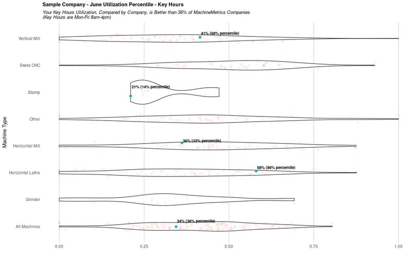
Currently, customers are compared on a factory-level and machine-type basis - that is, factories are ranked relative to each other, grouped by the type of machines they use. For example, the average utilization on vertical mills in Factory A is ranked against the average utilization of vertical mills in all other factories across our customer base, and average utilization on Swiss CNCs in Factory A is ranked against average utilization on Swiss CNCs in all other factories in our customer base.
At the end of every month, each participant in benchmarking receives their average utilization across the entire month, for each machine-type, as well as what percentile each machine-type falls into and the underlying distribution of utilization, like the following:
Though this has brought our customers great value, we realized that it’s unfair for a company with 50 machines to be compared against a company with only 5 machines. The latter, smaller company may have a very high utilization rate due to not having any excess capacity, but is it totally fair to rank it higher than the larger companies and push everyone else’s percentile down?
Luckily, there’s a fix for this. Instead of comparing companies against each other, we can instead compare individual machines against each other, allowing for a fairer comparison. In gory detail, the way we do this is: instead of assigning each company/machine-type pair a utilization average, we calculate this at the machine level first. So, whereas before we were comparing hundreds of company/machine-type pairs against each other, each with its own assigned utilization and respective percentile, we now compare thousands of machines directly against each other within the same machine-type. A mouthful, we know, but in essence, it has the effect of expanding our sample size of comparison and gaining a more accurate gauge on each company’s true percentile rank.
You can see the effect below, where each underlying distribution much more accurately represents the true distribution of machines for that category, and each dot represents where each machine falls now, instead of the average for the whole company. You’ll also see that there are many more dots, because each one represents a machine rather than a company/machine-type pair now. There’s also some key insights you can glean right off the bat from this, like the fact that Swiss CNCs are often used for higher-production, lower-mix shops and thus have a higher overall utilization than vertical mills, which are often used for long-running, complex parts that require extensive setups (Stay tuned for more insights at our next State of the Industry Update on July 20th).
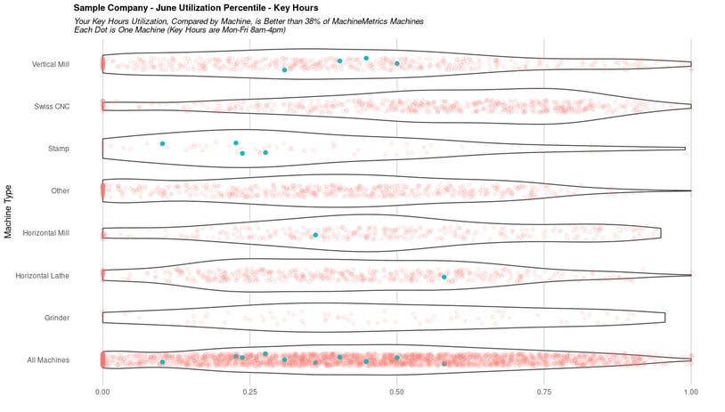
In effect, this allows our customers to gain two insights - a more accurate company-wide percentile ranking that takes into account how many machines they have, and individual rankings for each machine they have. For this company, the overall percentile only shifted by 2%, but a company that has very few or very many machines may see more of a shift.
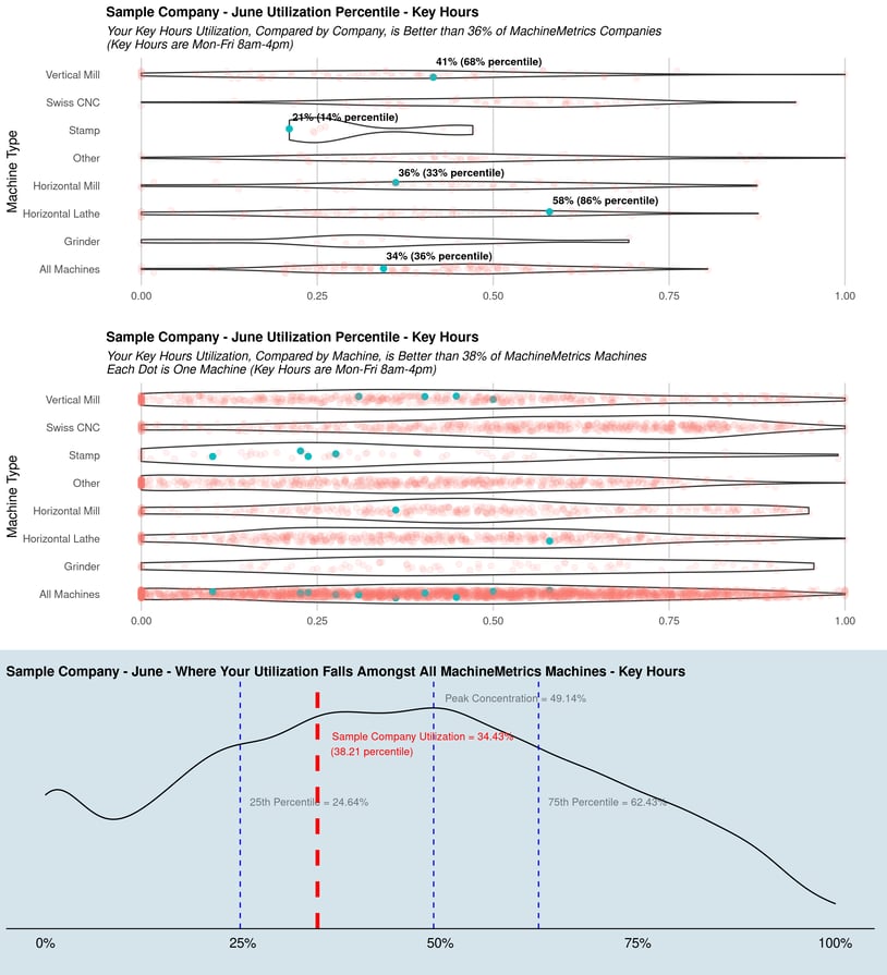
We will still display the company-level comparisons, but also add a plot for the machine-level comparisons. In totality, the new benchmarking plots will take the following form:
Thanks for reading, and hope to see you all at the next State of the Industry webinar, where we’ll discuss this in more detail and some more interesting insights.
Ready to empower your shop floor?
Learn More
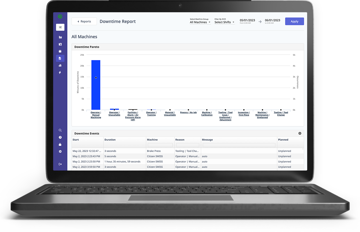
.png?width=1960&height=1300&name=01_comp_Downtime-%26-Quality_laptop%20(1).png)


.gif)


Comments