Book a Demo of MachineMetrics
The leading platform to collect, monitor, analyze, and drive action with machine data. Set up time with a product specialist to learn how we can help your operation.
Ready to empower your shop floor?
Learn More.svg)

No one could have really predicted the effects of coronavirus on our society writ large at the beginning of this year. This is evidenced in historic stock-market volatility (usually indicating unprecedented levels of uncertainty), rapidly changing policy decisions (as we struggle to respond to changes in the technical milieu of the day), and an ever more aggravated political climate.
As we approach the Fall, with schools and college campuses reopening and closing, as well as flu season on its way, uncertainty and volatility will surely only increase. The daily updates we provide on the actual state of the manufacturing industry will become ever more important, especially as more people who set policy use our data in their forecasts and in guiding their decision making.
We’ve been getting requests from many organizations, from manufacturing companies, to consulting and accounting firms, and even from government institutions on more detail behind how our data actually comes to be. The myriad of questions are understandable, as MachineMetrics is engaged in an entirely new category of machine optimization services, one which is a pure-cloud implementation and therefore offers not just customers the advantages of the cloud, but also us the advantage of an anonymized, aggregate measure for the industry. In this edition, we’ll go through some due diligence on how we actually get our data, in addition to the recent insights we can glean from it.
We often get questions like “How do you update your dataset when new machines are connected?”, or “How is your sample size large enough to even get these aggregated metrics?” “How can you ascertain that data from many thousands of machines is accurate?”
These are great questions, and can be perplexing for those who don’t come from both a manufacturing and a technology background. Let’s start from the basics.
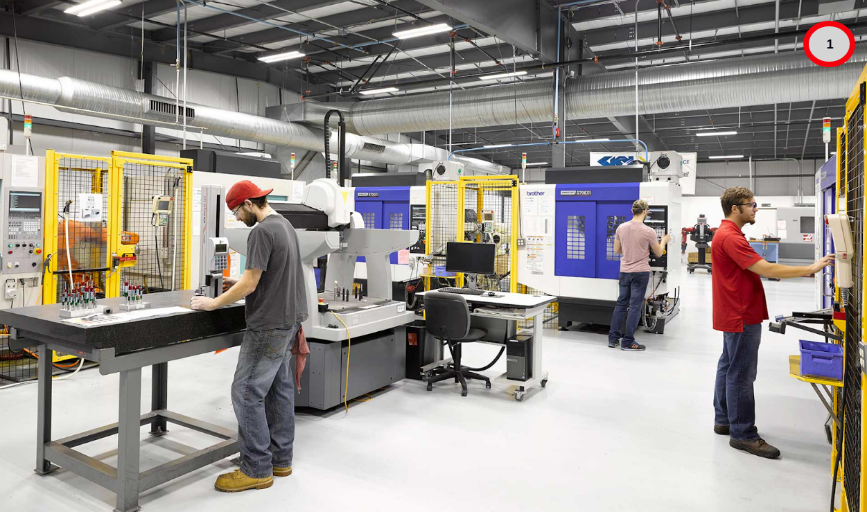
This is a typical machine shop, located somewhere in the US. Machines are not connected to any sort of machine optimization or monitoring service, and the shop floor manager only knows they’re behind in parts at the end of the day when an operator tells them they’re short. They then have to add extra shifts or put the machine in a feedrate overdrive to catch up, or just frustrate their customers by being short on parts and missing/pushing back a delivery date. It’s not great, but it’s how things have been done for the past few decades.
This is where we come in and enable an Industry 4.0 solution by having these machines be connected and their performance visible at all times. We are able to connect to the PLC (Programmable Logic Control) of these machines, which outputs all sorts of important information typically only visible to the operator standing right in front of the machine.
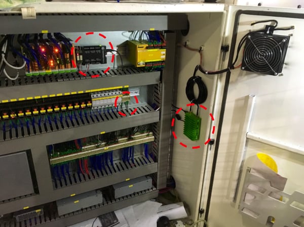
How do we do this? The secret sauce lies in our Edge device, which is basically a Windows/Linux IoT computer pre-loaded with a bunch of machine adapters that can translate, clean, and interpret the signals coming off the PLC. Each control manufacturer has their own API that lets us do this, and a large part of our intellectual property is in decoding these APIs and translating the individual languages into one, unified language. Below is a shot of a machine PLC, and the green/black boxes you see highlighted are our edge and Digital IO device. We simply connect into the Ethernet port on the PLC to extract the information the control is outputting, and then stream it up to the cloud. We make it easy enough that people can do install everything themselves without needing to have us come onsite; complexity is essentially transferred from the customer to the intricate technology inside the Edge device.
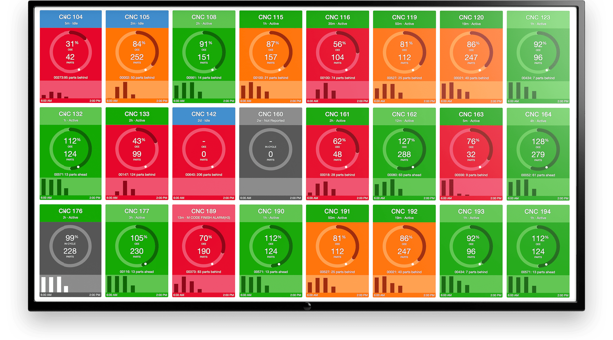
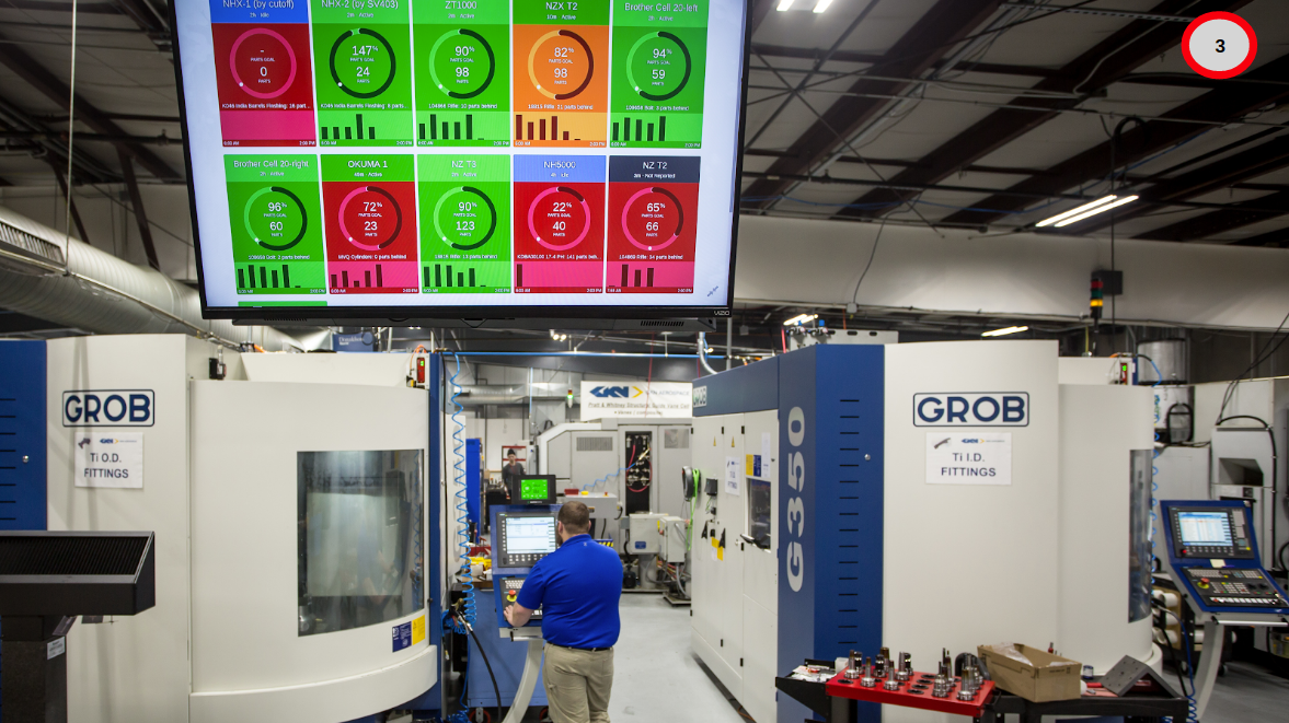
What do our customers get from this? Nice dashboards, which show them, live, how their machines are doing. What’s a machine across the factory floor doing? Is it on or off, who is operating it, and are they behind or ahead of their parts goal?
Being a product company, the primary work of MachineMetrics Data Science is in using this massive dataset to predict when machines will fail, and stopping them before they cause our customers damage or loss. This has the effect of making our product better, which means it can be easier to sell, which means we get even more data to optimize the machines we have under our umbrella. A virtuous cycle. For example, it can be extremely helpful to analyze what is causing a machine to fail at one customer, and leverage that data to both help that customer and other customers with similar machines and similar problems.
However, one of the wonderful side-effects of all this data is that we can also aggregate this information together, and see overall industry trends. This was not the main goal of our company in the first place, but because we’ve been diligently making our product better and enabling self-installed machines over the last five years, we have a significant and representative sample of the US manufacturing space now. One of the keys to doing this has been through making the product easy enough to both use and self-install, so that we don’t need to go onsite ourselves for most of our integrations and trainings. This allows us to scale exponentially and not linearly; we don't need to hire more integrators or trainers to keep up with demand.
Below is the table that our Data Science team works from to generate this analysis, scrubbed of customer-specific information. You can see that for each hour of each day, and for each machine, we receive automatically from our fleet of Edge devices:
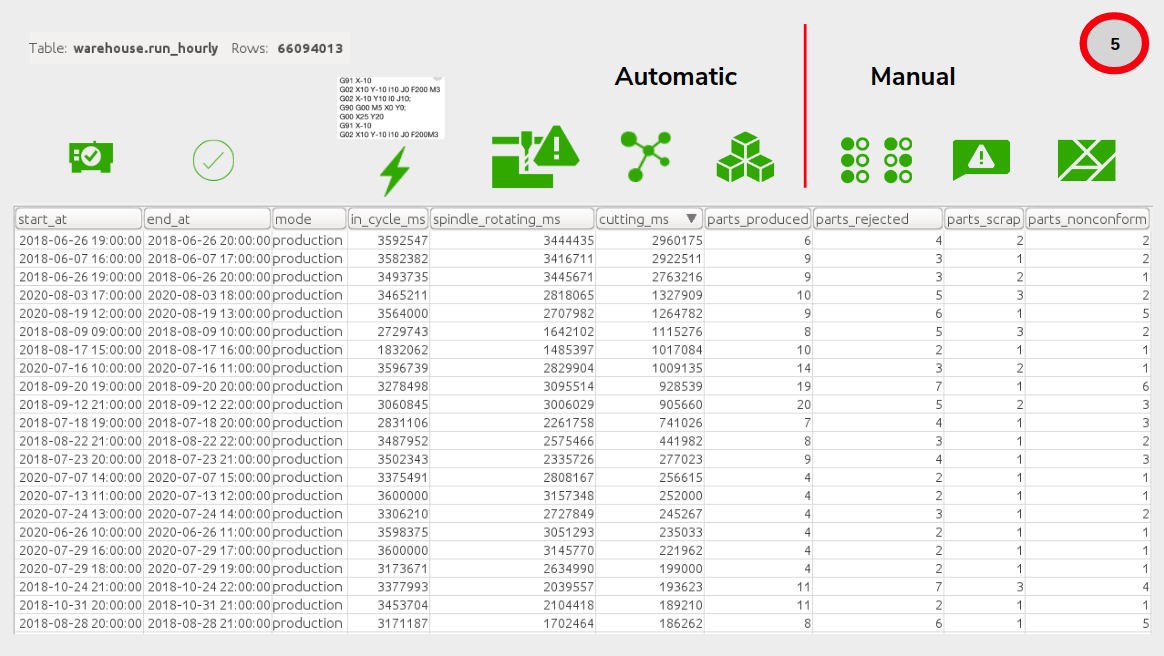
We also collect some manual-input items from operators at the machine, who can tell us, that of the parts produced:
You can see that we have about ~66 million machine-hours of production data recorded at this point, which we believe to be one of the largest and most complete in the manufacturing industry.
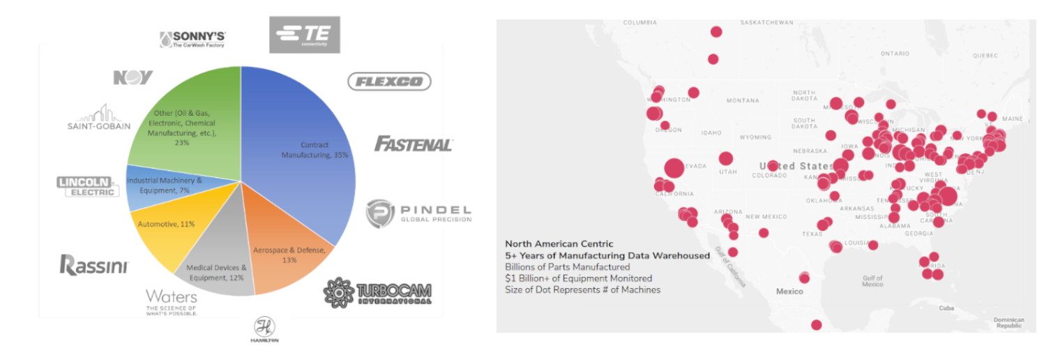
We have a diversity of customers in size, region, and industry. We are slightly under-represented compared to manufacturing as a whole for automotive, and over-represented in medical device manufacturing. We are also slightly over-represented in the Northeast, as that’s where our engineering team and headquarters are based. A distribution of our customer base is below, as well as some representative companies. The canny analyst, who desires an extremely precise measure for inputs to models or for predictive purposes, can construct a re-weighted measure of utilization based on our raw data. As our data becomes more widely used, it undergoes greater scrutiny for its robustness, assumptions, and sources. In this edition of the State of the Industry update, we felt it was important to cover all three areas.
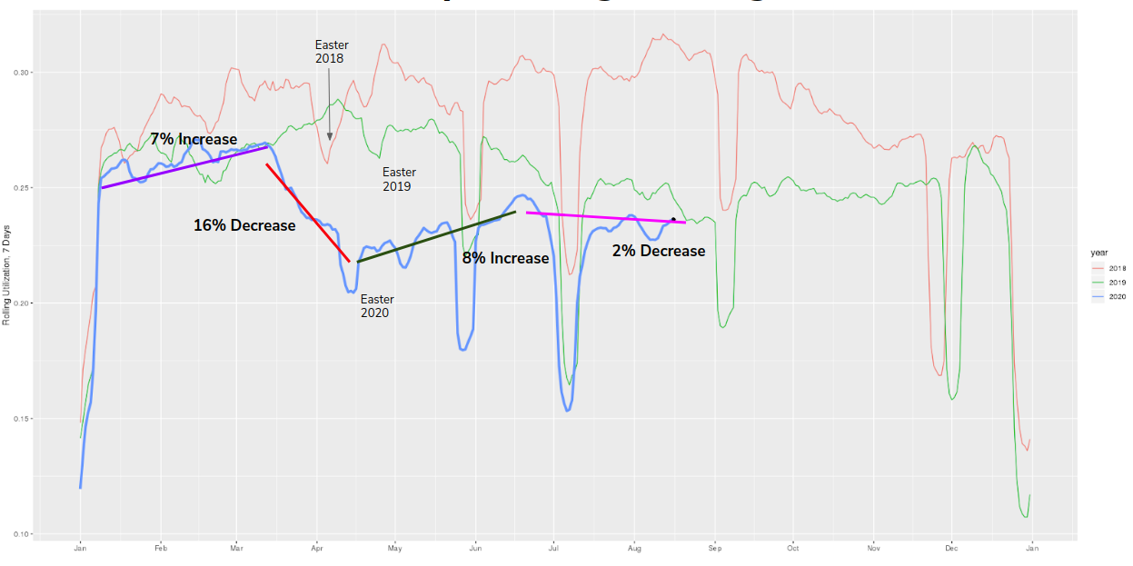
After all that...let’s start with the utilization updates we’ve been posting on LinkedIn every day, with some trends superimposed. We basically see four regimes happening throughout the year so far, which are:
Though these general trends may not come as a surprise to any of us, putting an exact quantitative indicator on them is our novel contribution. Never before has any organization been able to come up with an accurate, industry-representative high-frequency indicator for manufacturing performance.
This has great consequences for accurately assessing the state of the industry. Not surprisingly, this often manifests in our industry and geographic breakdowns. We’ll spend this section focusing on requests we've had to dive deep into certain industries and geographies.
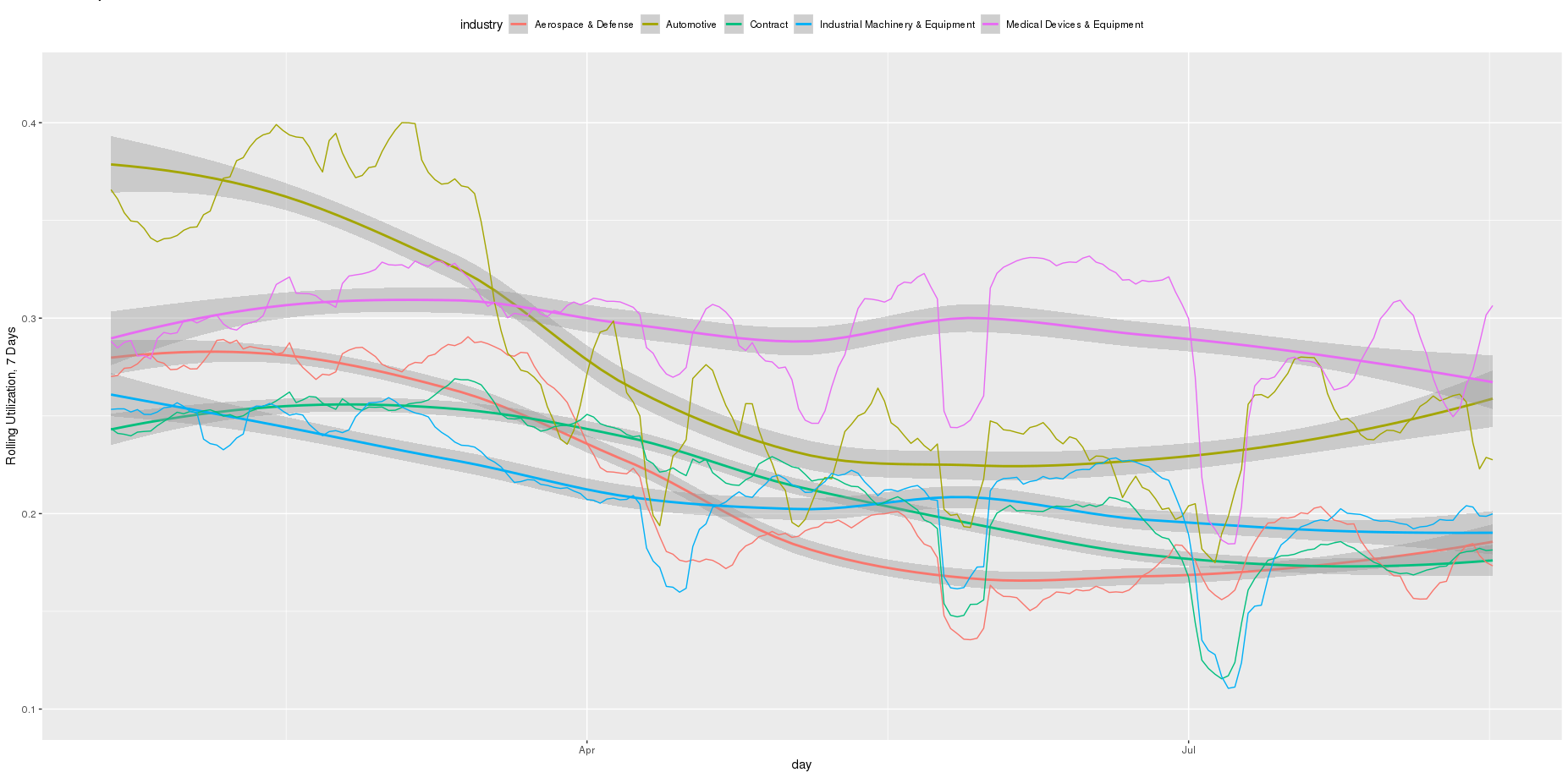
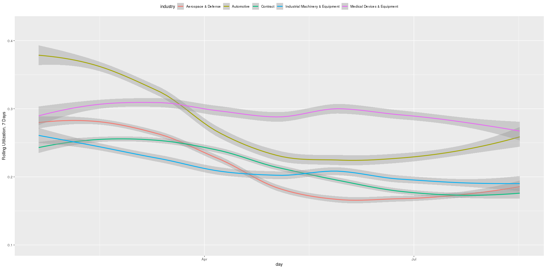
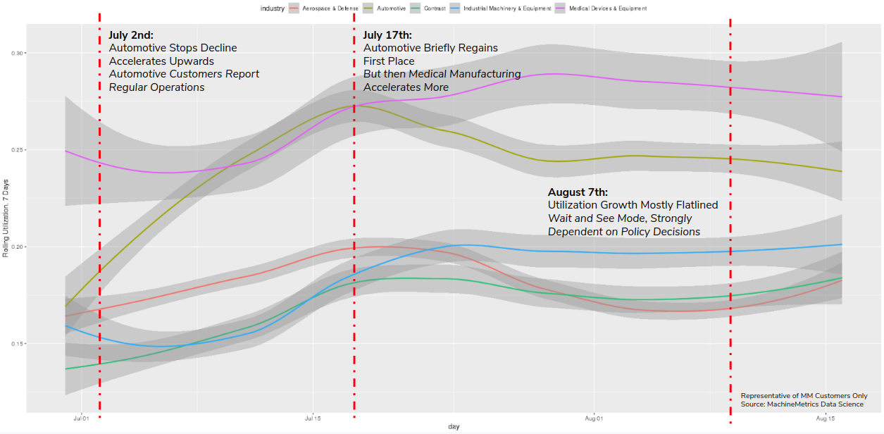
Let’s start with the industry level breakdowns, going back to the pre-COVID era this year. As you can see below, automotive absolutely collapses during late March, when factories are ordered to shutdown and consumer demand collapses. Medical device manufacturing however, remains stable through it all.
Let’s remove the rolling daily level changes to get a clearer view of overall trends. We’ll stick with these trendlines, which are constructed off a LOESS fit to the 7-day rolling average with a span of 0.75 (economists and analysts, get at me if you want more deets).
We then split this into three chapters and re-fit the LOESS curve per chapter.
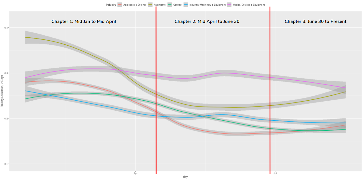
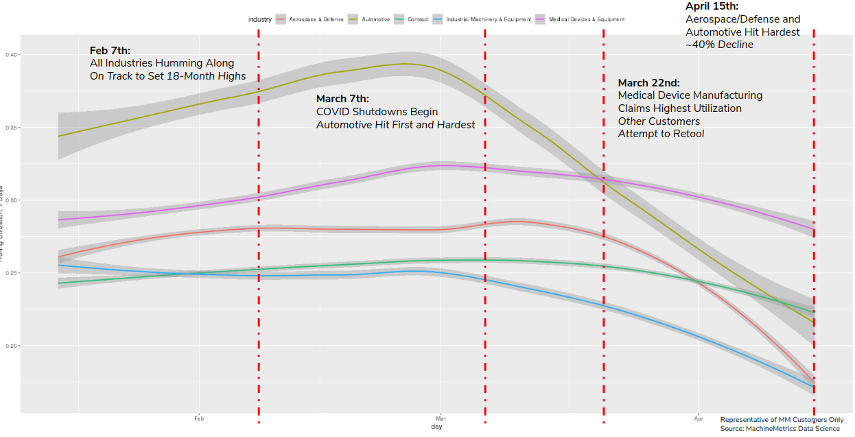
Let’s zoom in to the Mid-Feb to Mid-April period. At the beginning of February, all five major industries we track were humming along, about to set new 18-month highs. Automotive looked especially strong, as high consumer demand and increased purchasing sentiment caused many OEM and Tier 1 manufacturers to increase production levels, and therefore machine utilization. Other industries were either holding flat or increasing slightly.
Then, COVID shutdowns hit, and we see a textbook case of “taking the stairs up, and the elevators down”. We see this pattern in many other domains, such as the stock market. It takes a lot of stability and stuff to go right for things to slowly eek upwards, but just one major event for things to go down, and very quickly at that. Paired with a mandated shutdown, collapsing consumer demand obliterated automotive manufacturing, with utilization levels down 40% by mid-April. Some of our customers tried to re-tool to make ventilators and other medical equipment during this time, but it wasn’t nearly enough to balance out the shutdowns. On April 15th, we reach the lowest point of utilization we’ve seen in 3 years of tracking machine performance (excluding holidays).
From Mid-April to the end of June, we enter into a regime of uneven recovery. As the virus got more under control and lockdowns eased, companies restarted some of their production. Medical device manufacturing, unsurprisingly, extended its lead as there was a rush for ventilators and other medical equipment. Other industries, like Aerospace & Defense, Industrial Equipment Manufacturing, and Contract Manufacturing waver up and down during this period, looking for a breakout recovery but never seeming to achieve it. Automotive continued its decline, demand remained depressed as people were either forced to stay home or didn’t want to go out and make purchases as much.
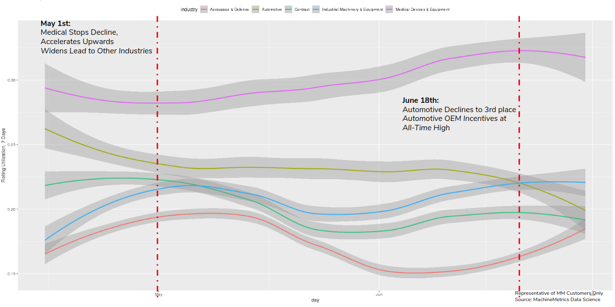
From July 1st to our current week, we see a slight recovery, then mostly flatlined performance for the last few weeks. Automotive customers started reporting regular operations to us, and we see this in their increased utilization as well. Coping with and developing strategies to live in the age of coronavirus may be major reason behind this, in addition to people venturing out more and having a bit more confidence in the economy. Consumer spending overall was up, which is sure to have an effect down the supply chain. Medical manufacturing increased as well.
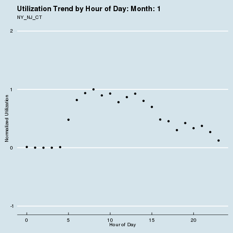
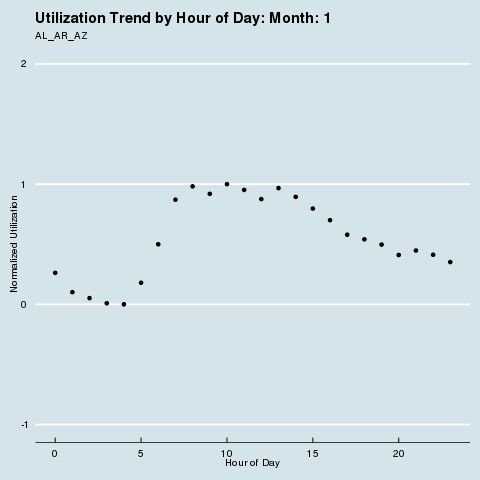
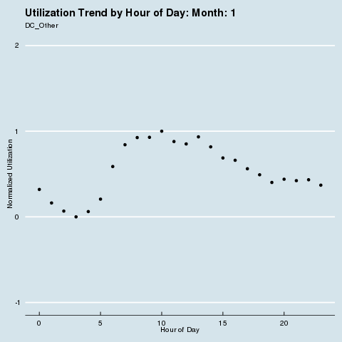
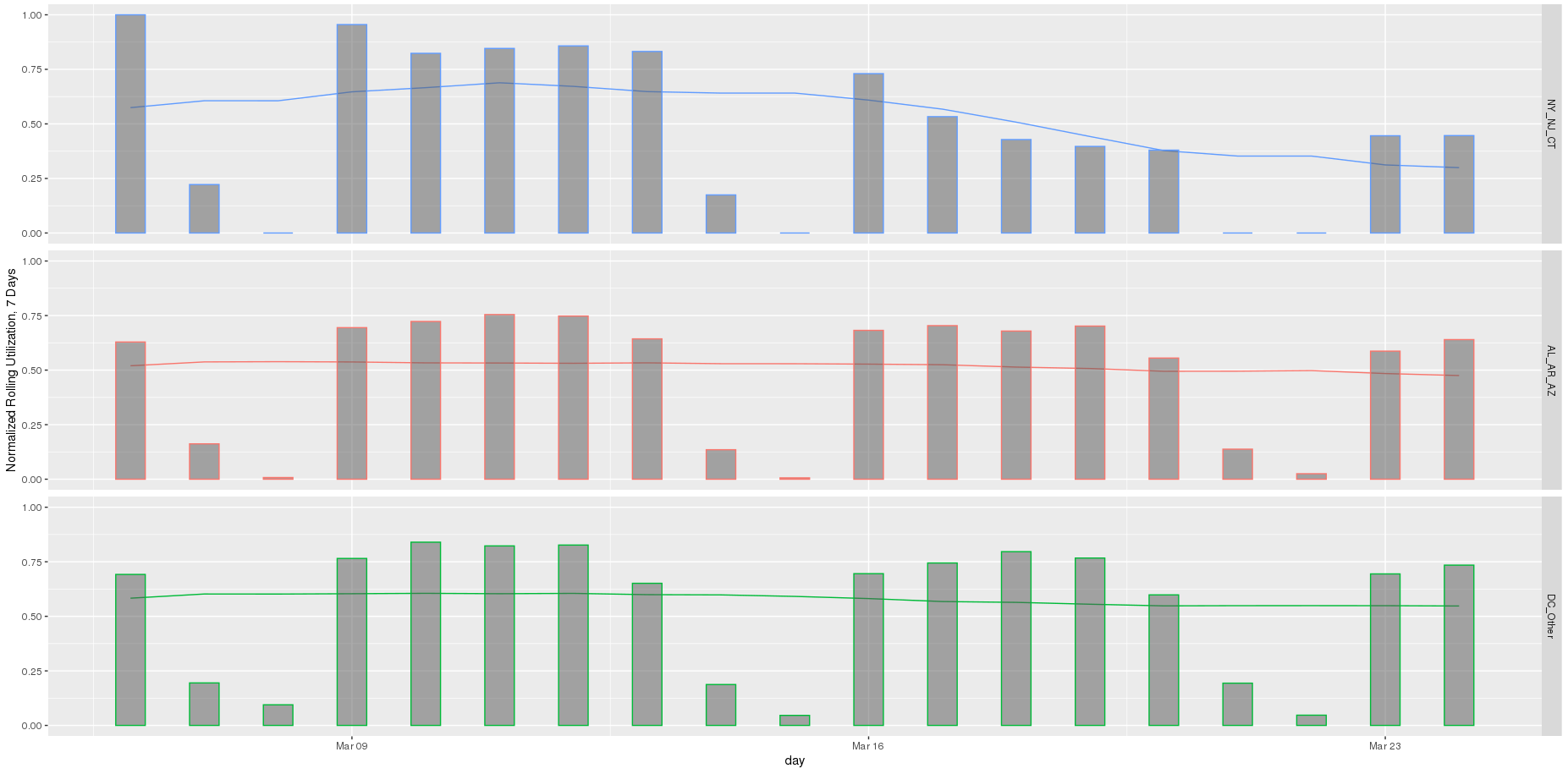
We subscribe to the following formal groupings for COVID risk - and can see a decided difference in the utilization distribution by hour for each geography. We renormalize utilization to be between 0 and 1 so we can see distributional differences more intensely (note the change in the Y axis title and values). Through this analysis, we can see that different states treat social distancing, via staggered shifts in their factories, more seriously than others. NY/NJ/CT in particular sees a stark difference in the spread of utilization by hour after March, with much higher utilization than usual during the wee hours of the night. This is because labor is being shifted from the main hours of 10 am - 4 pm to be more evenly divided around the clock, as evidenced by the “flatter curve” in the hourly distribution curve for NY/NJ/CT. The other states show a distinct lack of movement in their distribution, before and after COVID. It is fascinating how the effects of different subcultures in the United States and their treatment of coronavirus radiate all the way down to the factory floor level. We sort of knew this before, but putting some rigor around just how much this is true is quite remarkable.
COVID Risk Groupings
· Group 1: NY / NJ / CT
· Group 2: AL, AR, AZ, CA, FL, GA, IA, ID, LA, MS, NC, NV, OK, SC, SD, TN, TX, and UT
· Group 3: DC + Other (CO, IL, IN, KS, KY, MA, MD, ME, MI, MN, MO, NE, NH, OH, OR, PA, VA, VT, WA, WI, WY)
Group 1 |
Group 2 |
Group 3 |
Specifically, we see about a ~50% decrease in relative utilization the day after governors in NY/NJ/CT issue a total shutdown order. We speculate that means that ~50% of the shops we track were considered essential businesses who were able to stay open. Other states do not see this dip. Weekend activity, which is typically one-eighth of normal activity, totally disappears in NY/NJ/CT the weekend after the shutdown.
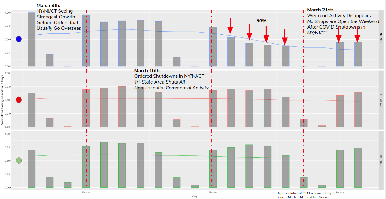
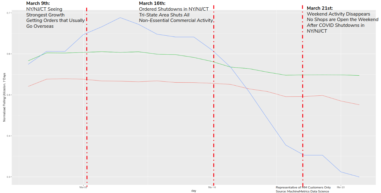
When removing the individual-day level bars, the difference becomes even more stark. We see these types of trends hold whenever strong legislative intervention is introduced. We suspect evaluating the effects of this will be ever more important as we enter into the last third of the year.
As we enter into the fall, we expect that flu season, students returning home from closed campuses, and other unusual events may have a strong effect on the spread of coronavirus, and in turn, industry utilization. At this point, we’ve demonstrated that our measure is extremely responsive to policy changes, especially those that will affect utilization in the downwards direction. The health of our industry, while in a “wait and see” regime right now, will inevitably be highly affected by our policy choices this fall. We hope that the makers, analysts, and economists of our industry can use this data to better inform the choices they make as we head into September. Data is power, and we can use this data to help both our industry and our nation be stronger. Data helps us make nuanced and rational decisions, backed by rigor and thought, rather than emotionally-driven impulses that only end up hurting us all more. It rests in all of our hands to ensure we make the best decisions possible during these tumultuous days, as these are critical times we live in.
We will continue to monitor these metrics and report out at regular intervals.
Ready to empower your shop floor?
Learn More
.png?width=1960&height=1300&name=01_comp_Downtime-%26-Quality_laptop%20(1).png)

.gif)


Comments