Book a Demo of MachineMetrics
The leading platform to collect, monitor, analyze, and drive action with machine data. Set up time with a product specialist to learn how we can help your operation.
Ready to empower your shop floor?
Learn More.svg)

This clearly has its drawbacks — chief among them an “information delay” due to the time it takes to survey, collect, and report on this data. The consequence is that market movements coincide with the release of this data; the stock market jumps up and down, often at the end of the month or quarter, due to the need to wait for publicly available data.
Recently, there has been an explosion of ways to get around this information delay and receive live updates on key indicators through the development of effective proxies. These proxies directly measure image, text, and sensor metrics close to the source of the actual indicator we’re trying to measure. Often times, the data itself is more valuable than the algorithms applied to them, which are typically commoditized at this point and can be called with an API. It’s getting the raw data itself that’s the hard part. Some examples are:

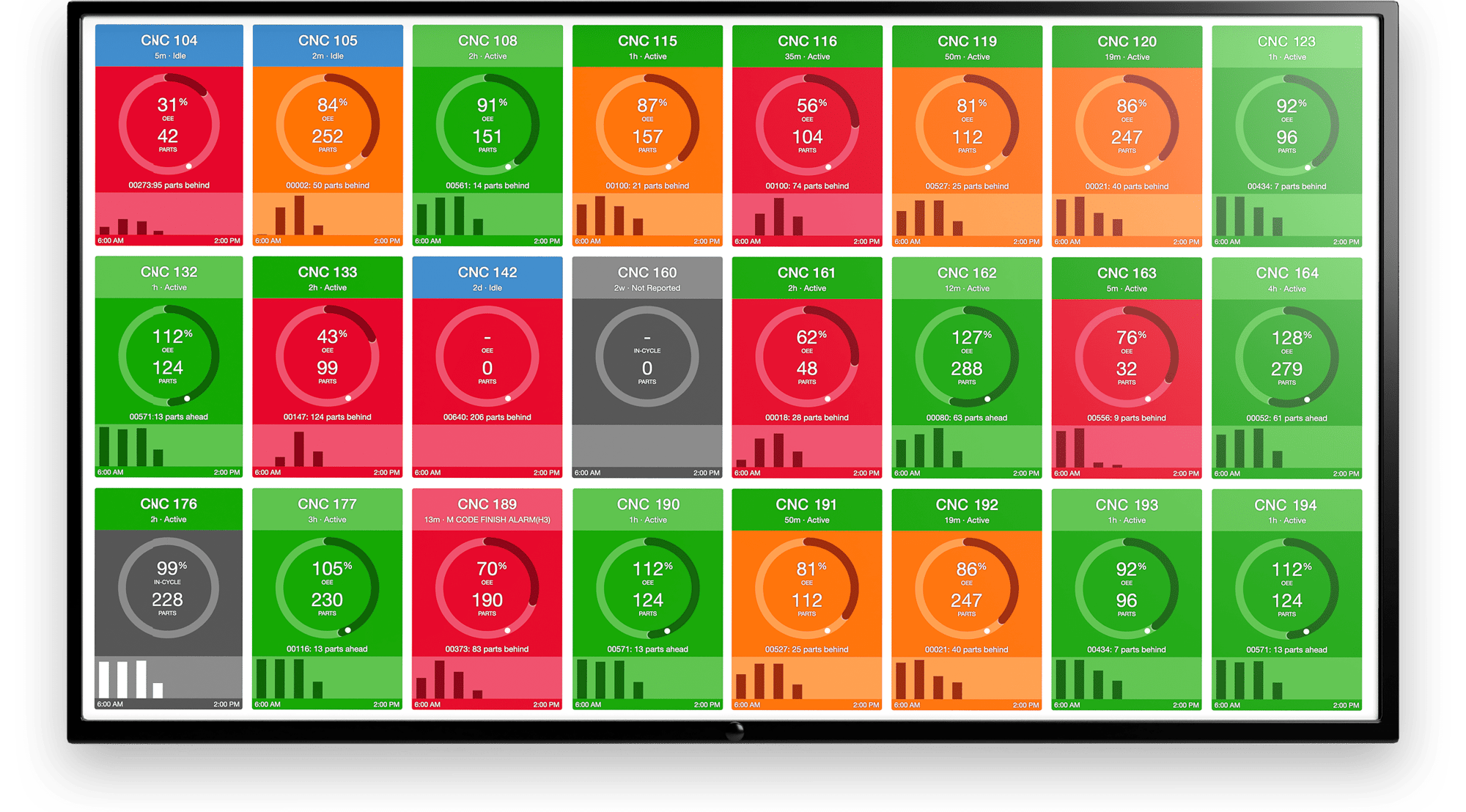
At MachineMetrics, we are in a unique position because we have acquired a large, proprietary data set straight from thousands of machine tools. We directly capture, anonymize, aggregate, and summarize information about utilization from the control of the machine with ~1s delay; this is the time it takes for information to stream from the factory floor to our servers and be processed.
However, knowing how and in what context this information is useful is what sets us apart from the competition. In this post, we go over how we combined domain knowledge with some simple statistical techniques to come up with an effective month-ahead predictor for a niche economic indicator.
Exploratory Data Analysis
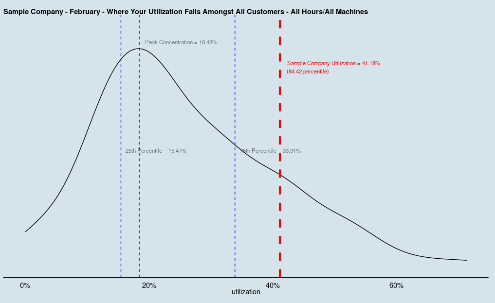
We first need to check out what our data looks like. From our database, we can extract utilization patterns of our customers for the past few years. We collect uptime/downtime from each machine we’re connected to, and can use this information over time to tease out trends and make sure our data doesn’t stray too far from reality.
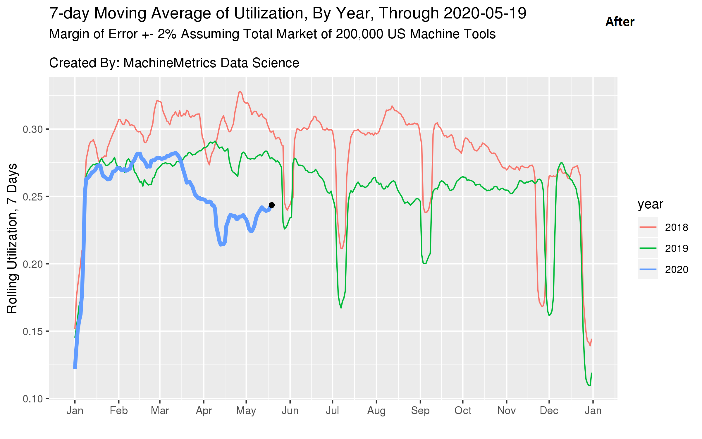
Let’s first look at a calendar plot of utilization over time and see if it passes some “common sense” tests we know about the manufacturing industry.
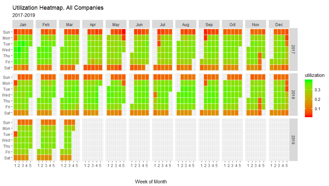
From this plot, we can clearly see that the data corroborates much of the industry knowledge people assume about manufacturing. For example,
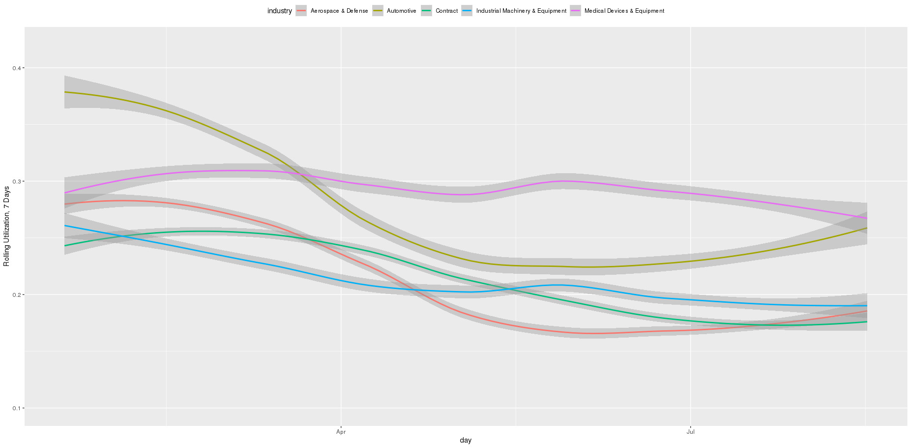
Grouped by day of week, we can see another view of utilization, with weekends having much lower utilization than weekdays.
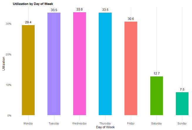
One interesting thing to note here is that outside of weekends, Mondays appear to have the lowest utilization…

The Problem of Autocorrelation
It should be noted that a problem we’ll need to deal with is called autocorrelation. In low-frequency economic indicators, like those reported by the Federal Reserve, data often displays this attribute.
Though it might sound complex, autocorrelation simply means that observations within the time-series are correlated with each other. Knowing one observation gives information about the others. Without getting too technical, this makes any sort of prediction or correlation coefficient invalid from a statistical standpoint, as much of the prediction could just be wrapped up in the fact that there’s a general upwards or downwards trend in the data. For example, yearly economic data is often autocorrelated. GDP in 2018 will depend heavily on where GDP was in 2017. It’s very unlikely that it’ll deviate much from where it was last year.
To alleviate autocorrelation, we can take the rate of change of the time-series. This “un-correlates” observations within that time series by removing the trend component. Taking GDP again as an example, the rate of change of GDP is much less related to what happened in the previous year — if you have an up year in 2017, you won’t necessarily have an up year in 2018 or 2019. But 2018 and 2019 will be near 2017 in absolute figures.
The Problem of Spurious Correlation in Economic Time-Series
Even when accounting for autocorrelation, another issue remains — spurious correlations. One thing we want to avoid is correlating our utilization figures with something that’s totally unrelated. With low-frequency data (monthly or annual), this is especially prevalent. For example:

Domain Knowledge
We can also alleviate some of these problems with some domain-specific knowledge.
In the United States, two types of manufacturing are tracked — durable manufacturing and non-durable manufacturing.
Durable manufacturing applies mainly to discrete manufacturers who utilize machine tools, which is MachineMetrics’ customer base.
This pointed us to look in the right direction — indicators which center around durable manufacturing. But which specific category of indicator should we look at?
Choosing the Right Indicator
There are many indicators that are relevant to manufacturing, but one particular metric sticks out. Capacity utilization.
Capacity Utilization measures the proportion of potential economic output that’s actually realized. MachineMetrics measures the proportion of potential factory output that’s actually realized, as measured in utilization rate of machines. It should follow that as enough of the market falls under the scepter of MachineMetrics, the two should be highly related, though there could be a lag-factor introduced.
Capacity utilization, formally defined by the Federal Reserve, is:
An output index (seasonally adjusted) divided by a capacity index. The Federal Reserve Board’s capacity indexes attempt to capture the concept of sustainable maximum output — the greatest level of output a plant can maintain within the framework of a realistic work schedule, after factoring in normal downtime and assuming sufficient availability of inputs to operate the capital in place.
The most important tidbit about “sustainable maximum output”. It’s not 100%; it needs to be reduced by what a realistic work schedule looks like, as well as normal, planned downtime. Since MachineMetrics is attached to the machine at all times, it’s not a direct corollary to what the Fed measures. Therefore, we’ll need to make some adjustments, which we’ll cover in the next section.
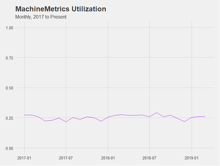
Exploratory Data Analysis II
First, let’s take a look at what our raw utilization data looks like.
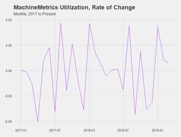
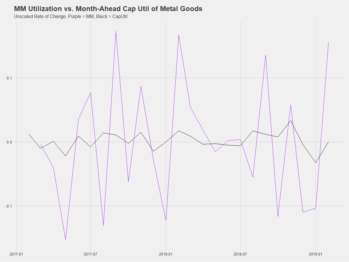
Now, let’s take the rate of change.
Next, let’s compare durable capacity utilization measures against our differenced internal utilization figures with a correlation plot. A correlation plot shows the degree of relatedness amongst pairs of time-series. The darker the blue and bigger, the more related, and the darker the red and bigger, the more inversely related the two series are.
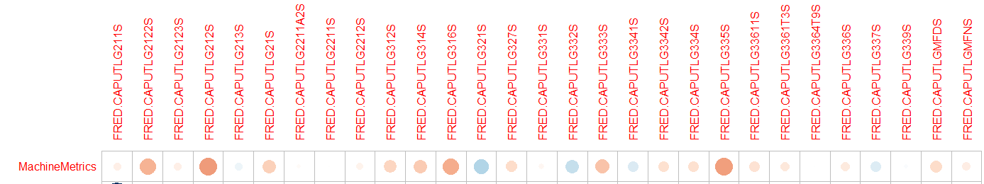
Hmm..it doesn’t look at first like there’s any strong measures of correlation, and there even appears to be many negative correlations. That doesn’t pass the sniff test. Let’s try lagging the economic indicators. This will have the effect of comparing current-month MachineMetrics utilization to next-month capacity utilization.
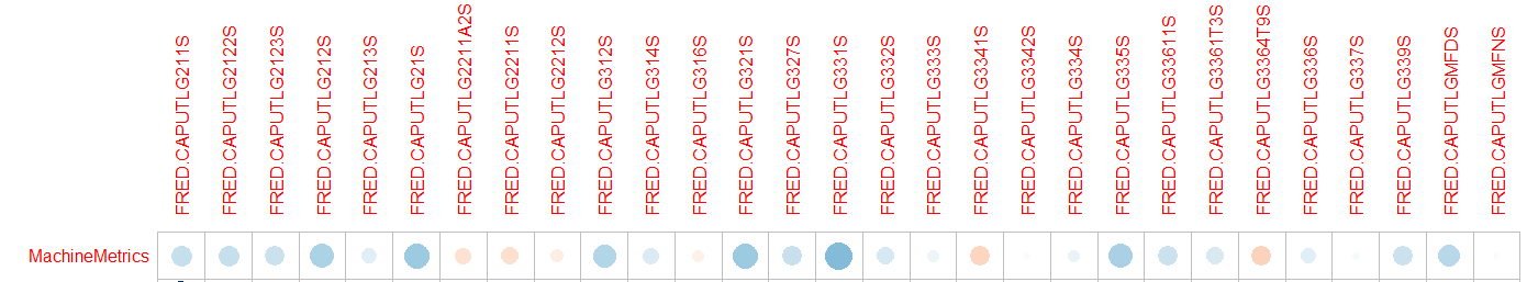
Wow, that looks a whole lot better. We can see that for several measures now, we have a significant relationship with the series. The top series appears to be CAPUTLG331S, which is Capacity Utilization for Primary Metal Goods. Let’s plot the two against each other.
Plotting just the rate of change may not do. This is because MachineMetrics’ utilization is about 3x lower than reported capacity utilization, so any changes are amplified in our data. Instead, we should plot scaled rate of change to put them on the same level.
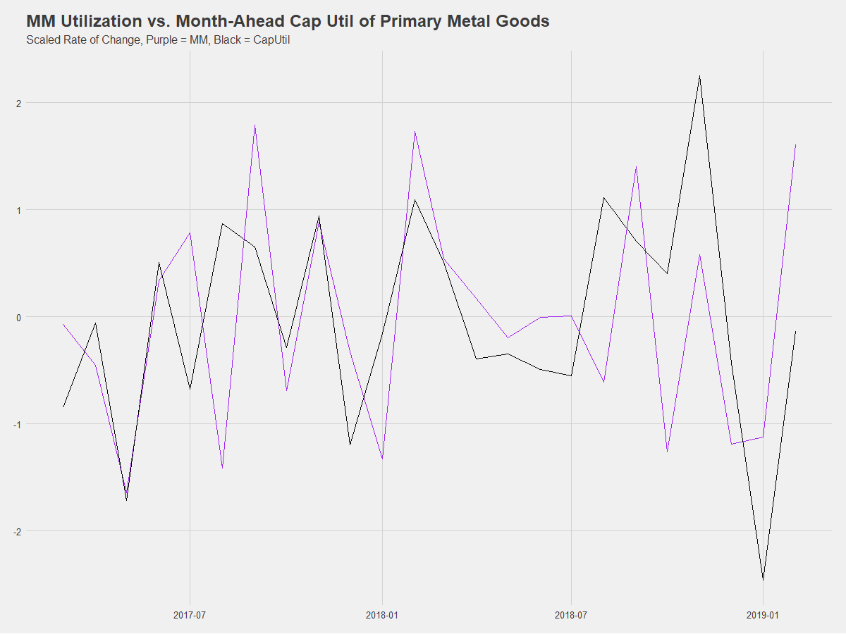
Ah, that looks pretty good. So what’s this mean exactly?
Interpretation and Caveats
We are showing that on a limited sample size, we’re able to fairly accurately predict month-ahead changes in capacity utilization for machines that produce primary metal goods. A 1% scaled change in our customers’ utilization foretells a ~1% scaled change in this cap util measure. In real-world terms, this means that a 10% relative change in customers’ utilization (22.2% to 24.2%) predicts a quarter-percent relative change (68.5 to 68.6) in this particular cap util measure.
Primary metal goods are things like the raw metal bars that go into bar feeders and the like. It makes sense that if factories (our customers) are consuming less of them (through less utilization), producers (the suppliers of our customers) would produce less of them.
Put another way, machine shops’ utilization going down means they consume less output from primary metal goods producers, whose reduced output is reflected in lower Capacity Utilization (CAPUTLG331S).
There are several important considerations to this though:
We haven’t shown that we have a bulletproof indicator here, but we’ll continue to track our correlation as this category does seem to be a good fit for what our coverage is.
Ready to empower your shop floor?
Learn More
.png?width=1960&height=1300&name=01_comp_Downtime-%26-Quality_laptop%20(1).png)


Comments